
The Next Steps in Our Data Journey (Threaded with Curiosity)
Since our last data journey blog in 2022, we’ve continued to stitch together our understanding of data – sometimes with confident lines, sometimes with a bit of unpicking. Two #GlosDataDays later, we’ve brought more people into the conversation, adding new ideas and perspectives to the fabric of our work.
Our self-assurance has grown. We’re no longer just making small adjustments—we’re exploring new ways to use data and AI to support creativity, collaboration, and impact.
AI has started to weave its way into more of our tools – sometimes by design, sometimes by default. A few feel genuinely helpful, most raise important questions around ethics, regulation, and environmental sustainability. We’re not rushing to adopt – we’re taking time to understand what fits and why.
Our data maturity journey hasn’t followed a straight line. It’s been full of learning curves, lightbulb moments, and the occasional reality check. We’ve grown in confidence – trying new tools, building skills, and getting more comfortable with data and AI. But with that growth has come a deeper awareness of just how much more there is to understand, and that’s shifted how we see ourselves.
Our latest Data Maturity Framework assessment saw a drop in scores – not because we’ve dropped a stitch, but because we’re now looking at our approach with a more critical eye. We see the gaps, the potential, the threads we haven’t yet pulled, or the ones we really don’t want to touch.
So no, we’re not unravelling. It’s less about ticking boxes and more about asking better questions, making thoughtful choices, and staying open to what’s next.
As we wrap up our current data strategy, we’re shaping the next one with a thimble of humility and a whole lot of curiosity. What do we want to create? With who? What is the cost? And what kind of impact do we want to weave into the future?
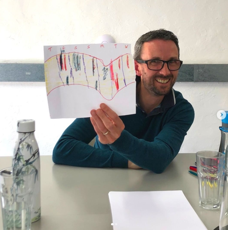
Alan Inman Ward sharing his ‘data scarf’ in 2022
Image: Create Gloucestershire
In the picture above Alan is holding a hand drawn ‘Data Scarf’. In 2019, crafters across the US partnered with the Tempestry Project to create scarves that represented temperature data for some of their natural parks. Using a simple colour coding system they knitted scarves that showed climate change through the different coloured wool in different years.
Have a go.
You can make your own “data viz” scarf or other creative data visualization. Find some data that interests you, such as the number of arts subjects offered in schools or people attending your events, and then graph the data for a over a period of time. After colour coding the data, you can visualise it on paper, a knitted scarf or anything else.
The Blog cover image has been created by a crafter Kathleen Roderick to show climate change in the Theodore Roosevelt National Park. Temperatures in 1966 on left, 2016 on right.
Image credit: Kathleen Roderick and the the National Parks Tempestry Project